Think Digital Hub

Redesigning Think Digital Hub to Increase Subscribers by 23%
Improving content discovery and engagement across articles, podcasts, videos, and events
PROJECT BACKGROUND
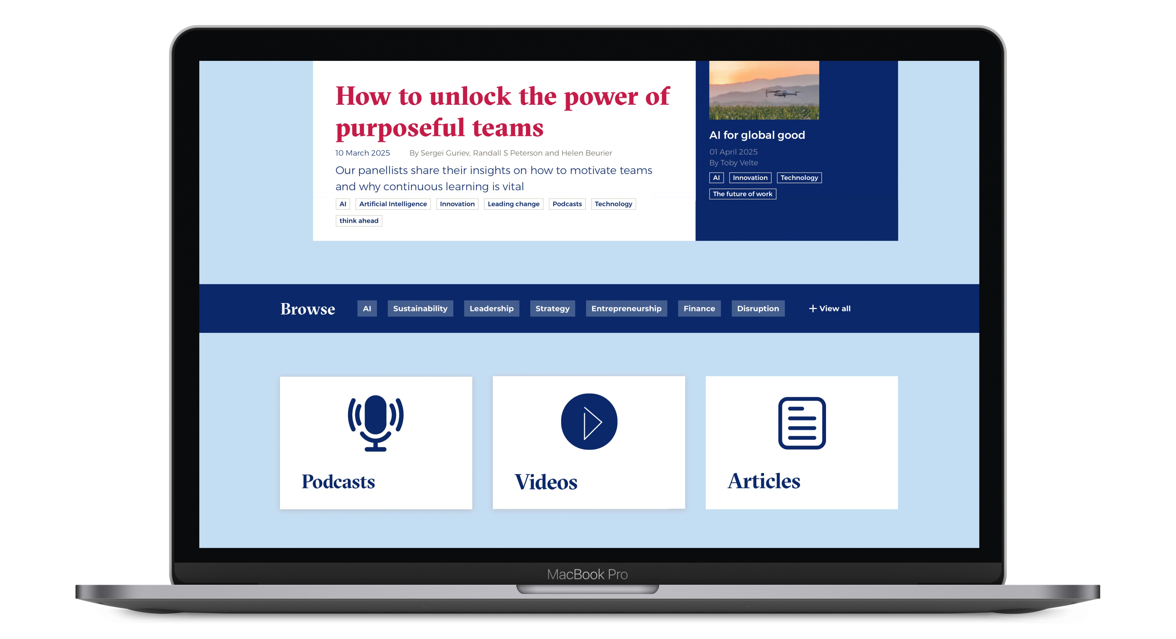
The existing Think Digital Hub presented content as a single, continuous list of articles. Key formats such as podcasts, videos, and events were not clearly surfaced, and navigation did not support exploration by topic, format, or author.
This limited the platform’s ability to:
Encourage content discovery
Communicate the “Think” concept clearly to new users
Position LBS as a credible, modern thought leadership destination
My Role
Lead Designer
End-to-end ownership across user research, interaction design, visual design, prototyping, and user testing
Timeline
Mar 2025 - Oct 2025
PROBLEM
Users visiting the Think Digital Hub struggle to find and explore diverse content types due to unclear navigation, content organization and layout.
USER RESEARCH
Research Goal
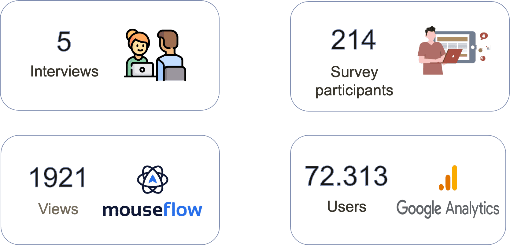
RESEARCH
Google Analytics

SURVEY
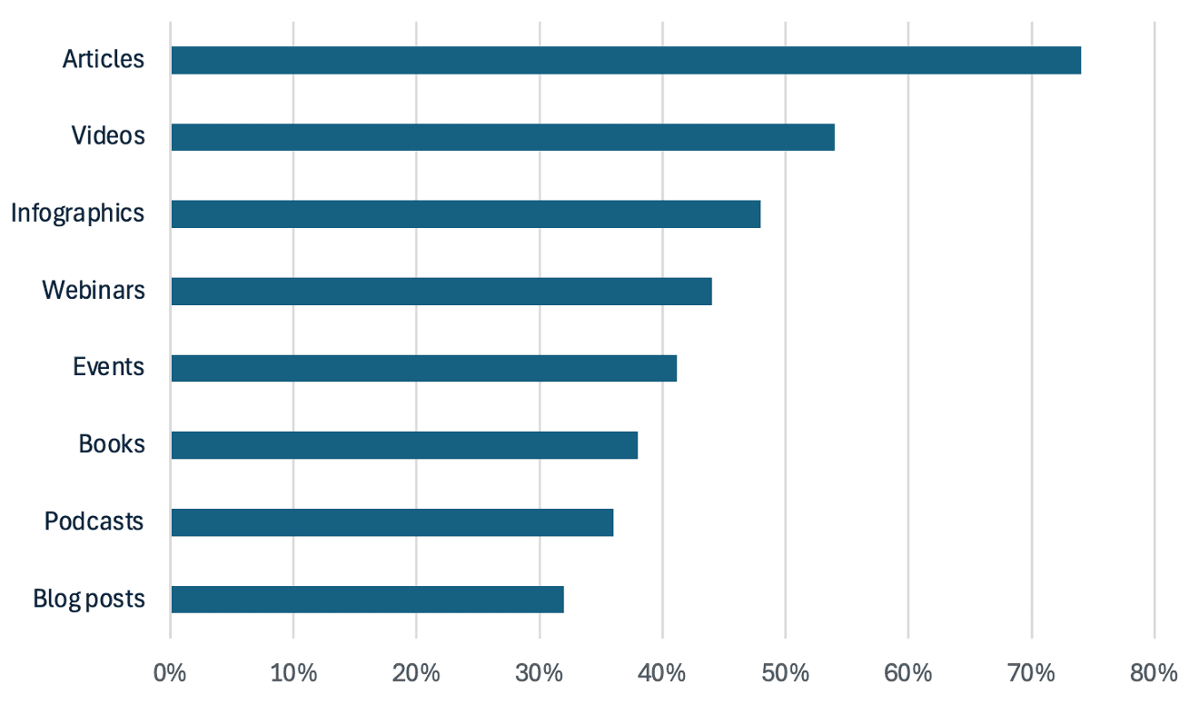
What thought leadership formats would you like to see represented in future?
RESEARCH
Users perceive the articles as blog posts and feel that some lack sufficient supporting data
New users struggle to fully grasp the Think concept, even when navigating its homepage and menu.
There is a preference for consuming articles on desktop while engaging with podcasts on mobile
Students prefer reading articles authored by professors they recognize, in addition to searching for specific topics.

RESEARCH
New users struggle to understand what Think offers
First-time visitors to Think might find it difficult to grasp our offerings
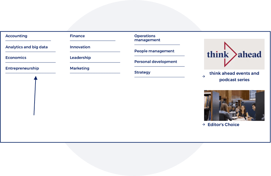
The topics section is sometimes overlooked by users, and certain areas, such as coronavirus or accounting, may not be of high interest.
Podcasts lack visibility and do not stand out on the pages.
Section does not stand out
Some topics are outdated for users
RESEARCH
Navigation
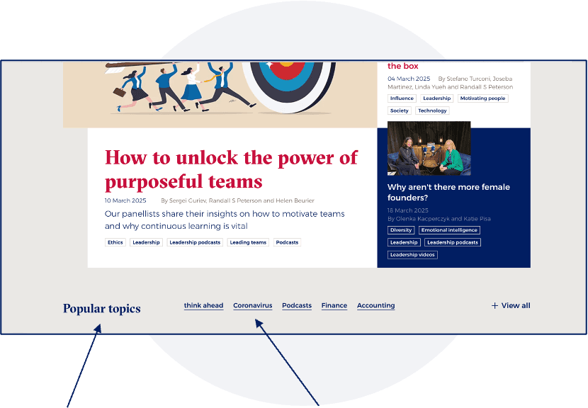
The "Popular Topics" section does not stand out effectively. Additionally, some topics displayed do not align with user interests.
On the article page, most users do not realize that author names are clickable.
The mega navigation design creates confusion, as users struggle to differentiate between Think topics and academic programs, sometimes perceiving them as areas of study.
RESEARCH
Lack of consistency on article pages
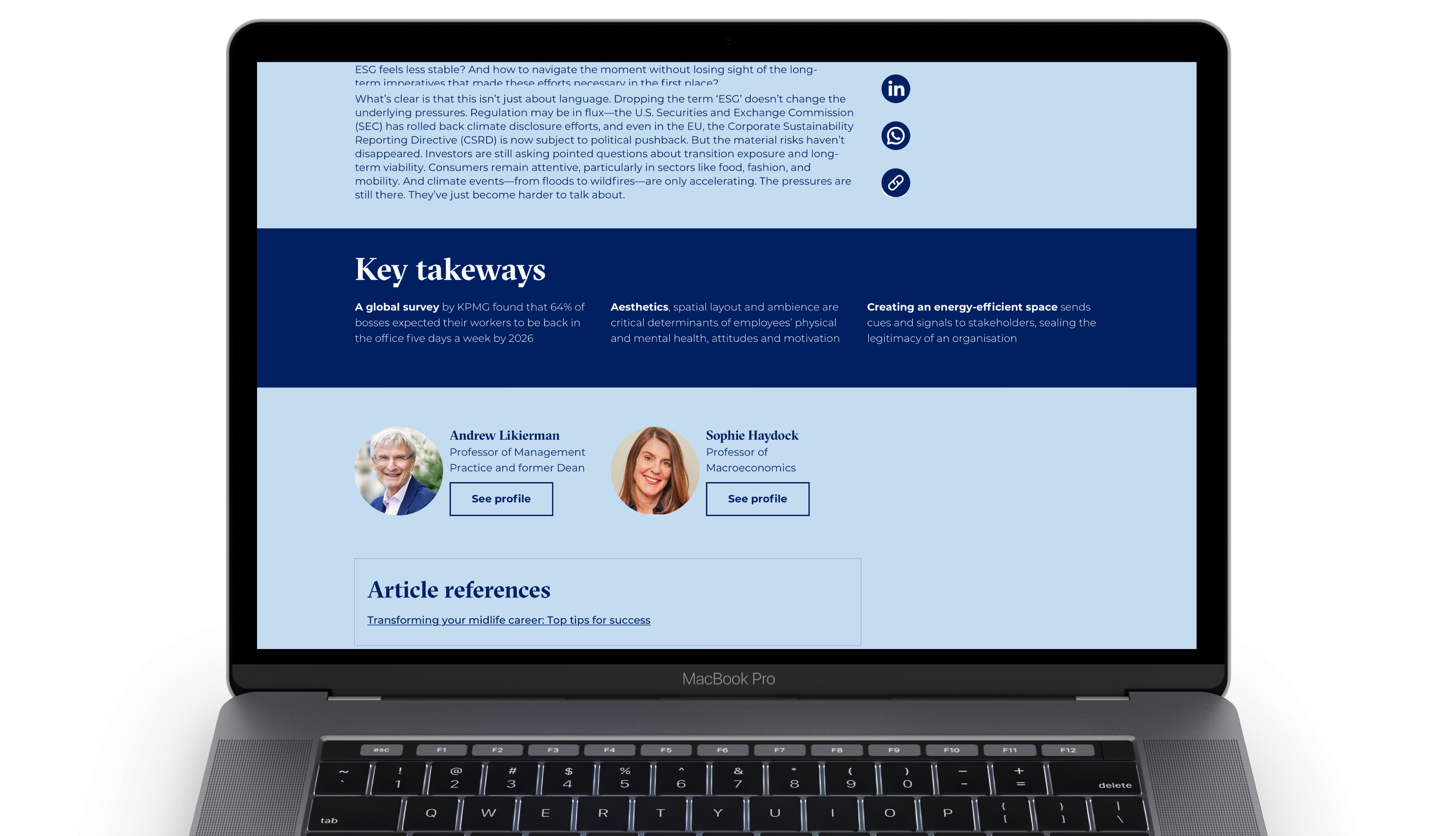
Article pages lack consistency in layout, with variations in edge-to-edge formatting, header and subheader usage and text formatting.
Users were unaware that author profiles were accessible. Upon discovering them, they encountered inconsistencies that caused confusion.
Users express strong appreciation for the inclusion of quotes within articles and the "In 30 Seconds" section.
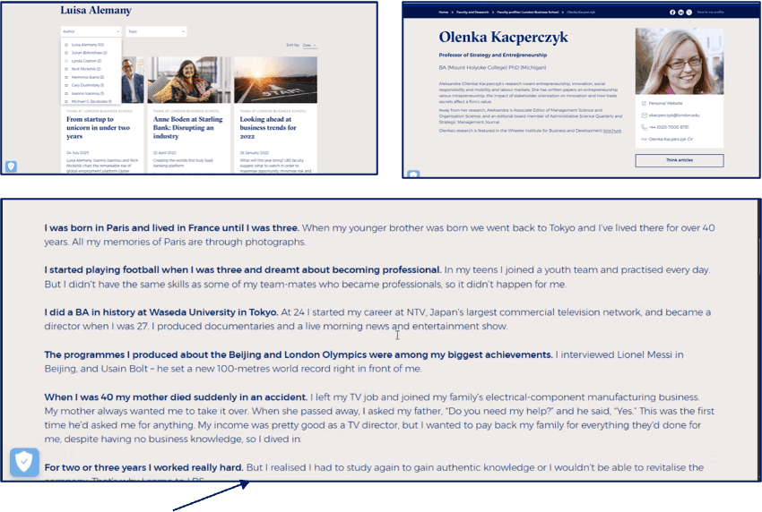
The article goes edge to edge, which is more difficult to read
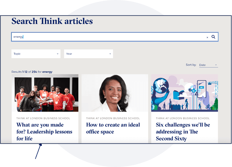
RESEARCH
Search relevance and content clarity
IDEATION
Workshops and Ideation Sessions
I facilitated multiple workshops with stakeholders and the development team to:
Align on business goals and success metrics
Explore new navigation and content grouping models
Prioritize design solutions based on feasibility and impact

FINAL DESIGN
The Solution: A Clear, Multi-Format Content Experience
Final Design Outcomes
Introduced clearer navigation and content categorisation by topic and format
Elevated podcasts and non-article content to improve visibility
Standardised article layouts to improve readability and trust
Improved author discoverability to encourage deeper exploration
Enhanced search clarity with stronger content-type signaling
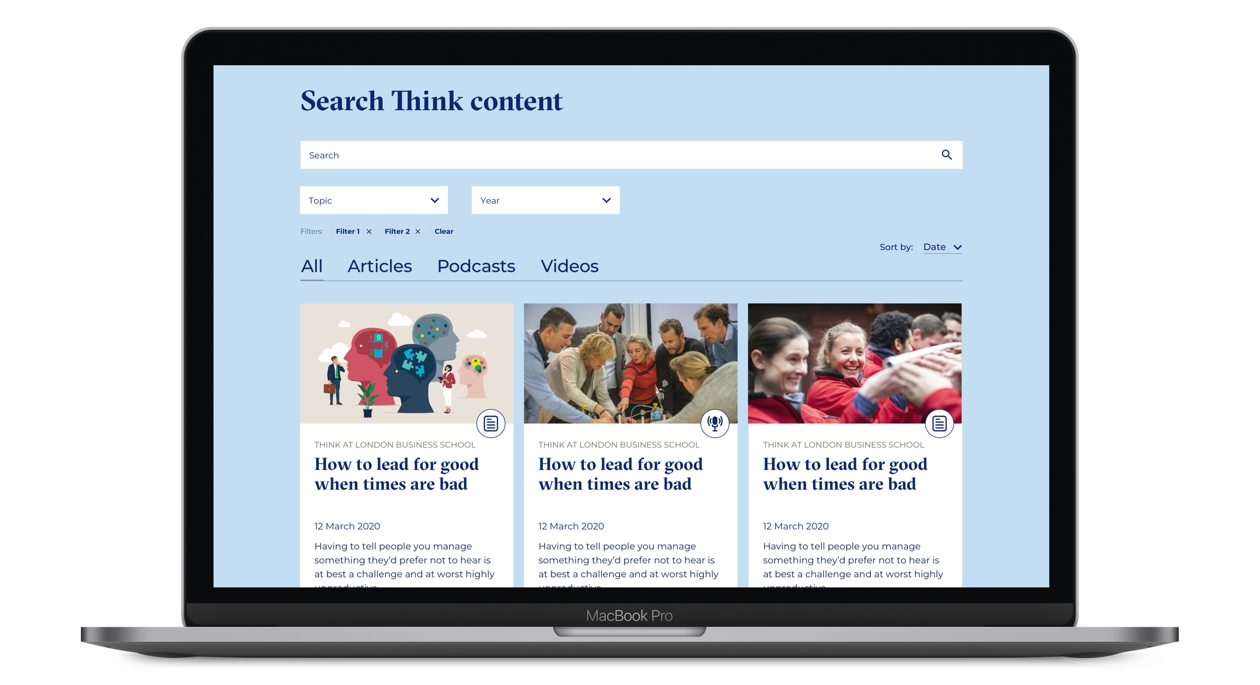
All Designs

IMPACT
Impact & Outcomes

Increased subscribers by 23%

Reduced bounce rate by 9%

Increased time spent on site through improved content discovery

Strengthened Think’s positioning as a thought leadership hub, not just a blog
LESSONS LEARNED
Reflections: What I’d Do Differently Next Time
1
Validate Design Decisions with A/B Testing
Running A/B tests on key elements such as homepage layouts, topic sections, and share buttons, could have provided stronger quantitative validation.
2
Increase Survey Sample Size
Gathering responses from a broader user base would have improved confidence levels and reduced margins of error.
3
Conduct Deeper User Interviews
Including more first-time visitors would have helped uncover mental models and expectations earlier in the process.


