Canvas Course Application

Increasing task success rate from 45% to 100% and active users by 23%
PROJECT OVERVIEW
Canvas Course is a B2B application used by students at London Business School to manage their learning activities, such as accessing course materials, submitting assignments, and tracking progress. Despite its wide adoption, students frequently struggled to navigate the platform efficiently, leading to confusion and repeated requests for assistance from faculty members.
Timeline
Oct 2024 - Apr 2025
My Role
Lead Designer
CHALLENGE
Students found it difficult to locate essential course materials and complete key tasks within Canvas Course.
DEFINE
User Research
To effectively frame the problem, I conducted a combination of qualitative and quantitative research. This included gathering user feedback through interviews and surveys to understand their behaviors, needs, and pain points.
By analyzing both subjective insights and measurable data, I was able to gain a comprehensive understanding of the user experience, which informed the direction of the redesign and ensured that the solution addressed real user challenges.

APPROACH AND METHODOLOGY
The research identified 3 key findings:


Inconsistent layouts across courses and sessions, along with unused sections, made it difficult for users to navigate the pages and find relevant information.

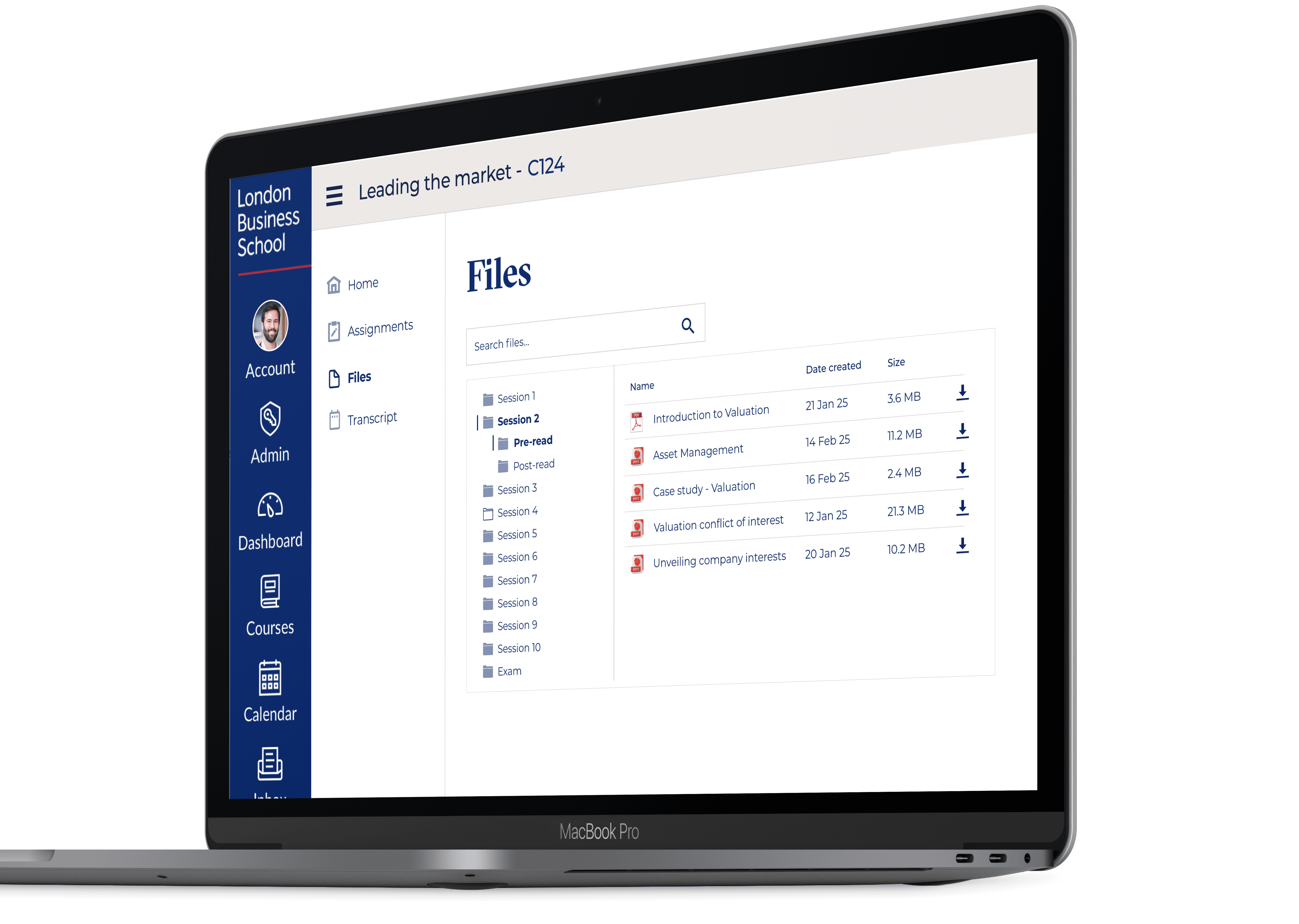
Finding documents is very time consuming for students, searching across multiple locations, including Files, Session pages, and various folders.

Unclear submission processes, assignment status updates, and grade visibility create anxiety for users.
IDEATION
Ideation
I facilitated and led an ideation session with the core team, using the "How Might We" framework to encourage creative problem-solving. The session focused on identifying and prioritising key opportunity areas, with particular emphasis on Files, Sessions, and Courses, to align efforts with user needs and business goals.


TESTING
User Testing
Following the ideation session I created the wireframes that were voted and agreed in the meeting and performed user testing with a few students,. There were some good points raised by the students that were refined for the navigation between sessions and files, information displayed and ability to download files.
FINAL DESIGNS

LESSONS LEARNED


