[Case 02]
25% Growth in Checkout Completion
Fintech

Accelerating 15% Growth in Acquisition for Payment Solutions
Boosting Conversion Rates for E-commerce Checkout
[Project Overview]
Faced with a 40% cart abandonment rate, I redesigned the checkout flow to address user pain points. By simplifying the process, optimizing for mobile, and adding features.
[Problem Statement]
The platform struggled with a 40% cart abandonment rate during checkout. Users encountered unclear error messages, redundant fields, and poor mobile optimization, leading to frustration and drop-offs.
Timeline
Fintech
My Role
Lead Designer
25% increase in checkout completion rates.
30% reduction in cart abandonment on mobile devices.
40% improvement in perceived ease of use, as measured by post-launch surveys.
[Outcome]
Users visiting the Think Digital Hub struggle to find and explore diverse content types due to unclear navigation, content organization and layout.
[Outcome]
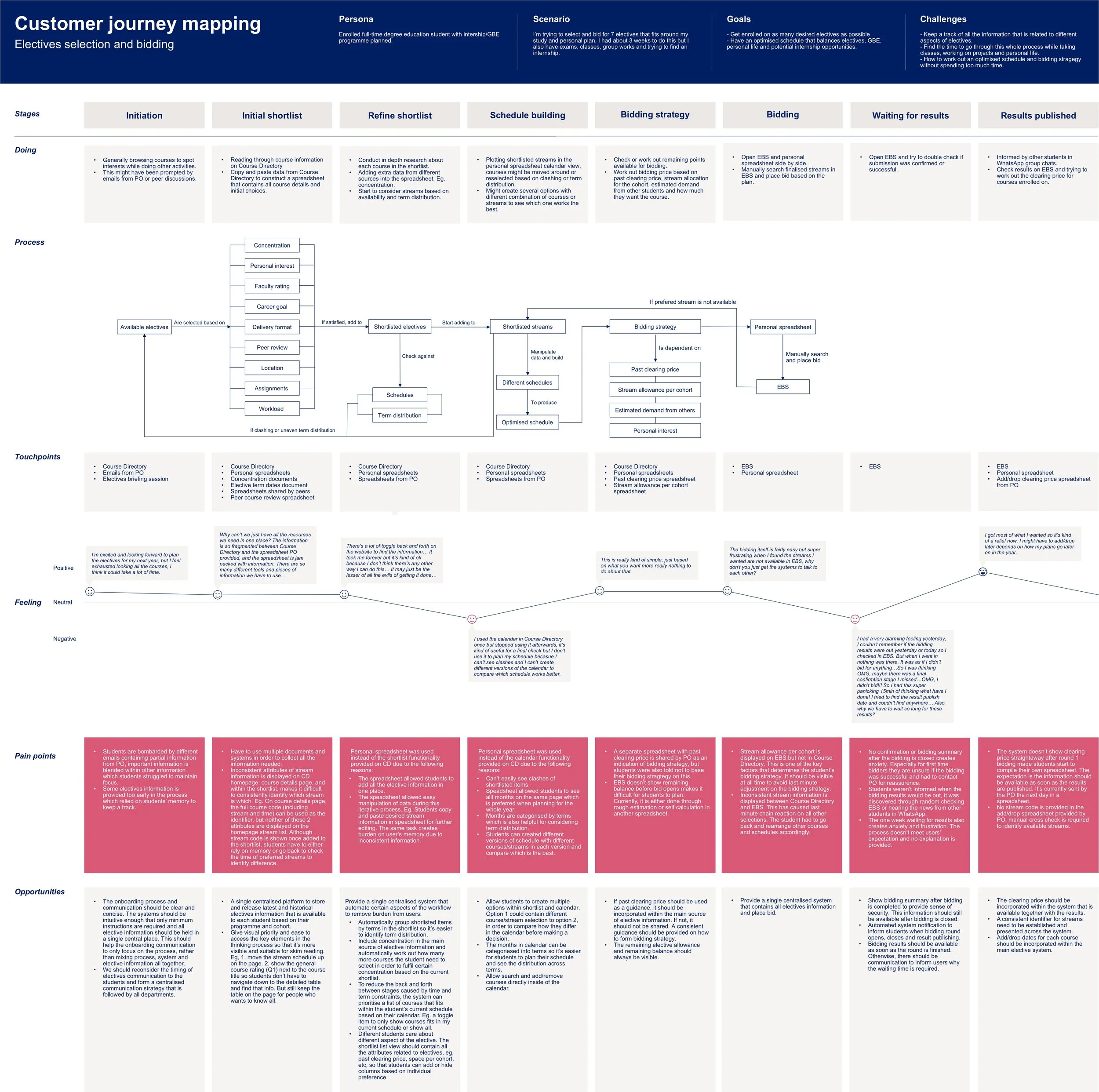
Research question
“How might the elective selection and bidding experience ensure degree education students to thrive in their study at LBS and be best prepared to achieve their career goals?”
[Outcome]
Research
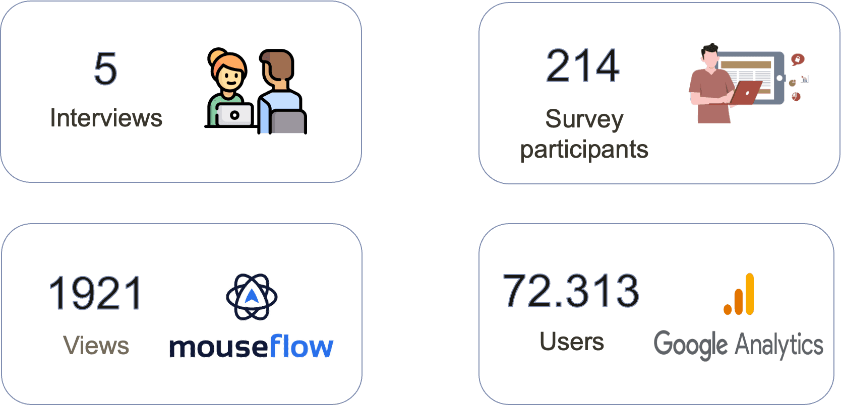
[Outcome]
Google analytics

[Outcome]
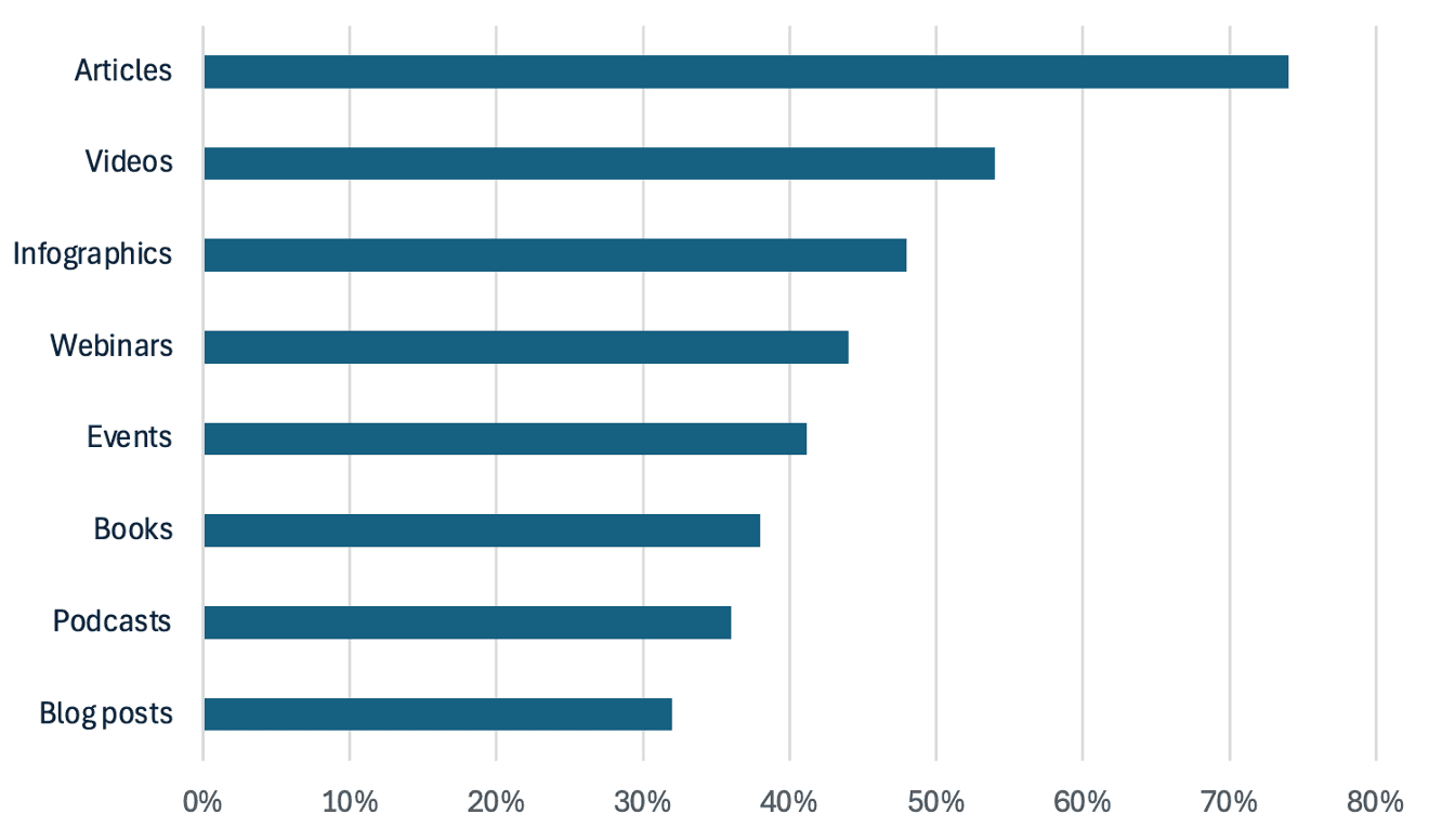
What thought leadership formats would you like to see represented in future?
RESEARCH
Users perceive the articles as blog posts and feel that some lack sufficient supporting data
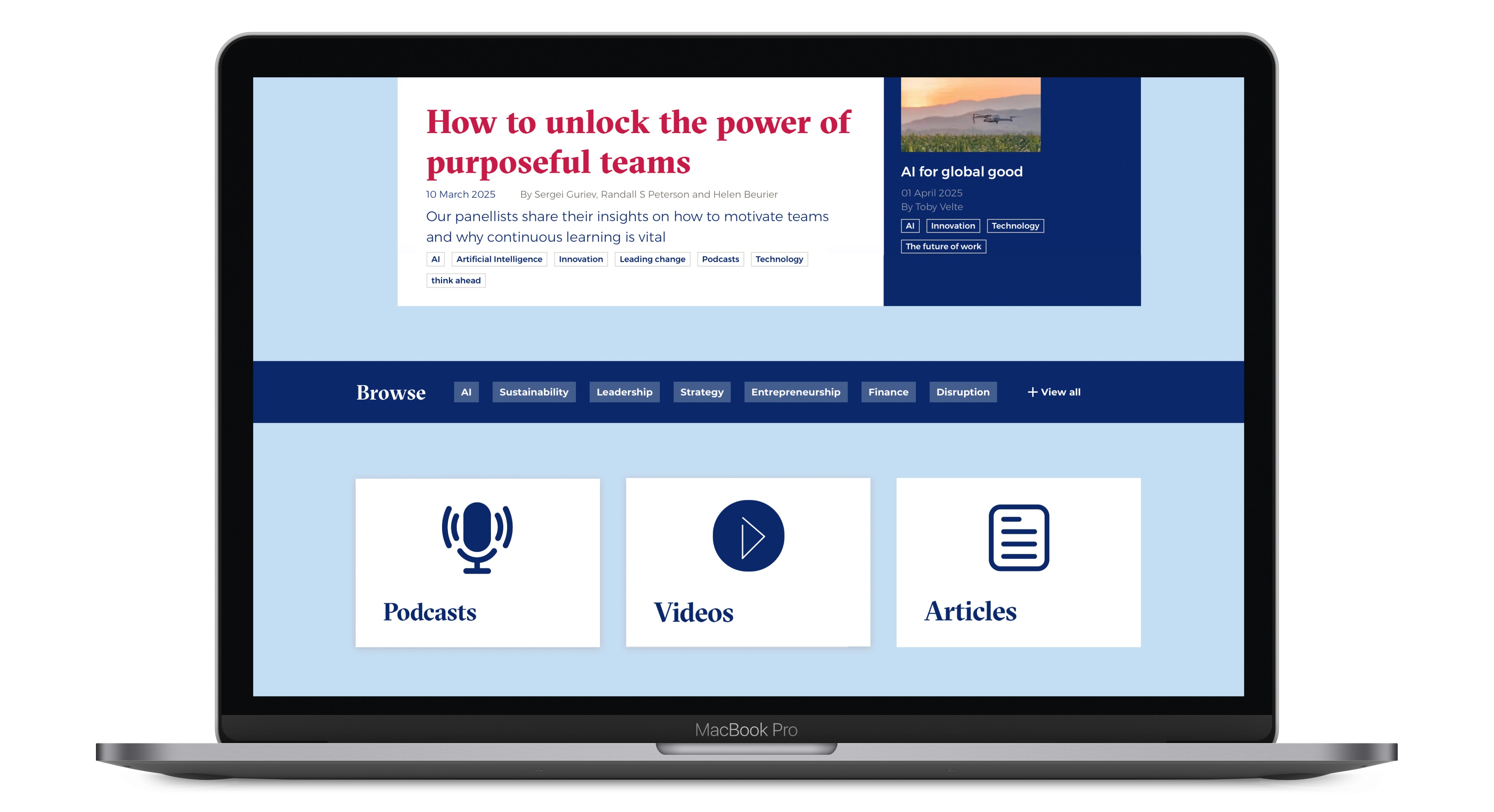
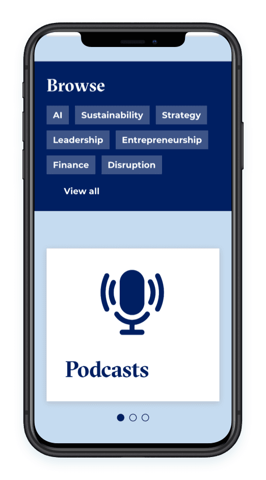
New users struggle to fully grasp the Think concept, even when navigating its homepage and menu.
There is a preference for consuming articles on desktop while engaging with podcasts on mobile
Students prefer reading articles authored by professors they recognize, in addition to searching for specific topics.

RESEARCH
New users struggle to understand what Think offers
First-time visitors to Think might find it difficult to grasp our offerings
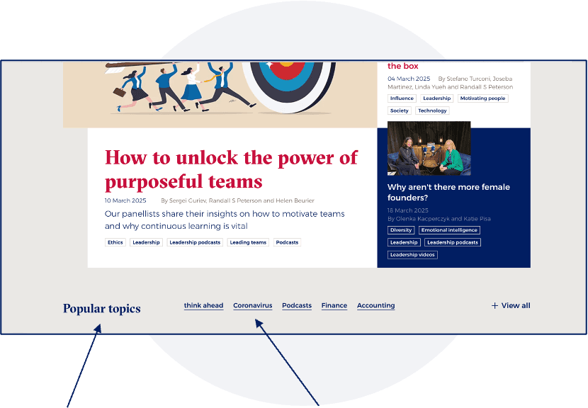
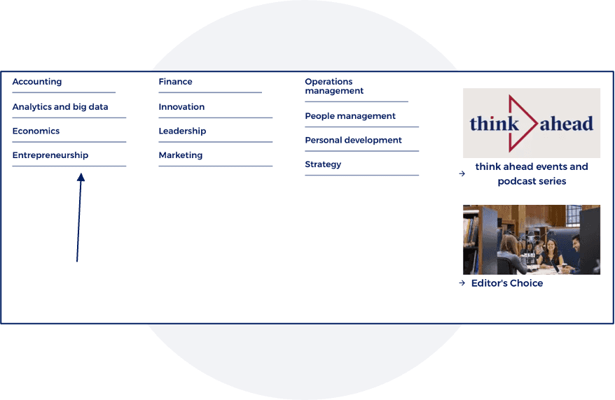
The topics section is sometimes overlooked by users, and certain areas, such as coronavirus or accounting, may not be of high interest.
Podcasts lack visibility and do not stand out on the pages.
Section does not stand out
Some topics are outdated for users
RESEARCH
navigation
The "Popular Topics" section does not stand out effectively. Additionally, some topics displayed do not align with user interests.
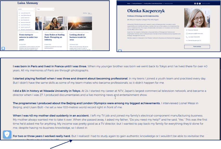
On the article page, most users do not realize that author names are clickable.
The mega navigation design creates confusion, as users struggle to differentiate between Think topics and academic programs, sometimes perceiving them as areas of study.
RESEARCH
Lack of consistency on article pages
Article pages lack consistency in layout, with variations in edge-to-edge formatting, header and subheader usage and text formatting.
Users were unaware that author profiles were accessible. Upon discovering them, they encountered inconsistencies that caused confusion.
Users express strong appreciation for the inclusion of quotes within articles and the "In 30 Seconds" section.
The article goes edge to edge, which is more difficult to read
RESEARCH
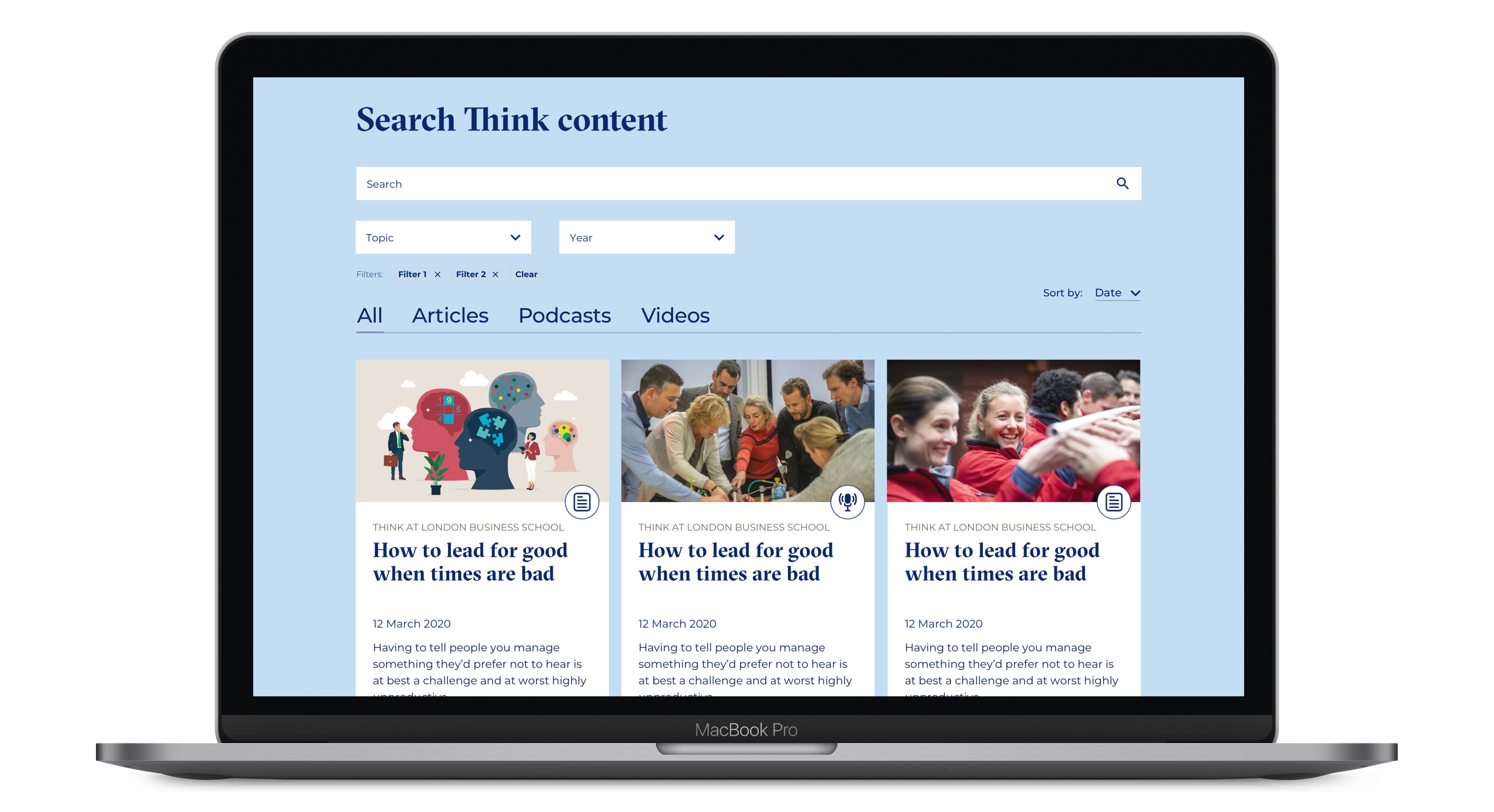
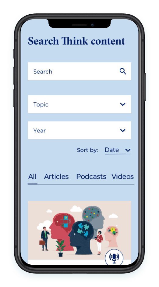
Search relevance and content clarity
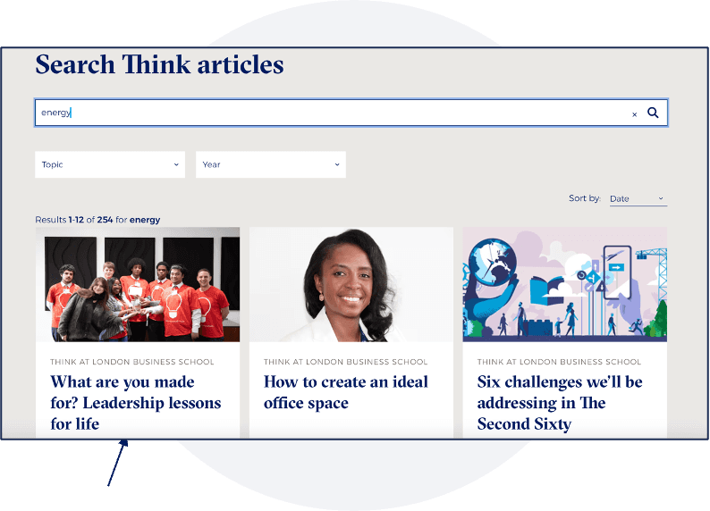
The search functionality is essential for users to efficiently locate desired content.
There are instances where keyword searches give unexpected results, reducing relevance and user satisfaction.
The topic field can confuse users, especially when topics are displayed alongside podcasts, which often results in misunderstanding.
Users seek clarity on whether their search results are podcasts or articles.
The article goes edge to edge, which is more difficult to read
RESEARCH
Workshops and Ideation
I held multiple workshops with stakeholders and Dev team

[Outcome]
Users perceive the articles as blog posts and feel that some lack sufficient supporting data
[Outcome]
FINAL DESIGNS
All Designs
I held multiple workshops with stakeholders and Dev team

[Outcome]
What I could have done differently
1
A/B Testing
Running A/B tests on key elements (homepage layout, topic sections, share buttons) could have guided design choices with measurable results.
2
Obtain more users for survey
Ensure there is a good signifiance level of error from the survey.
3
Conduct More In-Depth User Interviews
3. Conduct More In-Depth User Interviews
Would have been good to find a more diverse range of users for the interviews, especially first-time visitors to better understand their mental models, expectations, and pain points.